Long before anyone had heard of ChatGPT, three data scientists at Princeton decided to build a bespoke generative AI to help the world’s leading financial firms turn complexity into clarity, data into intelligence, and intelligence into money. Fast forward to late 2023, and Rogo was almost ready to ship. But first, they asked us to create a distinctive brand that would connect all the strands of their customer experience, from marketing to the product itself.
What we did
- Brand Strategy
- Branding
- Copywriting
- Animation
- Website Design
- Development
- Product Experience

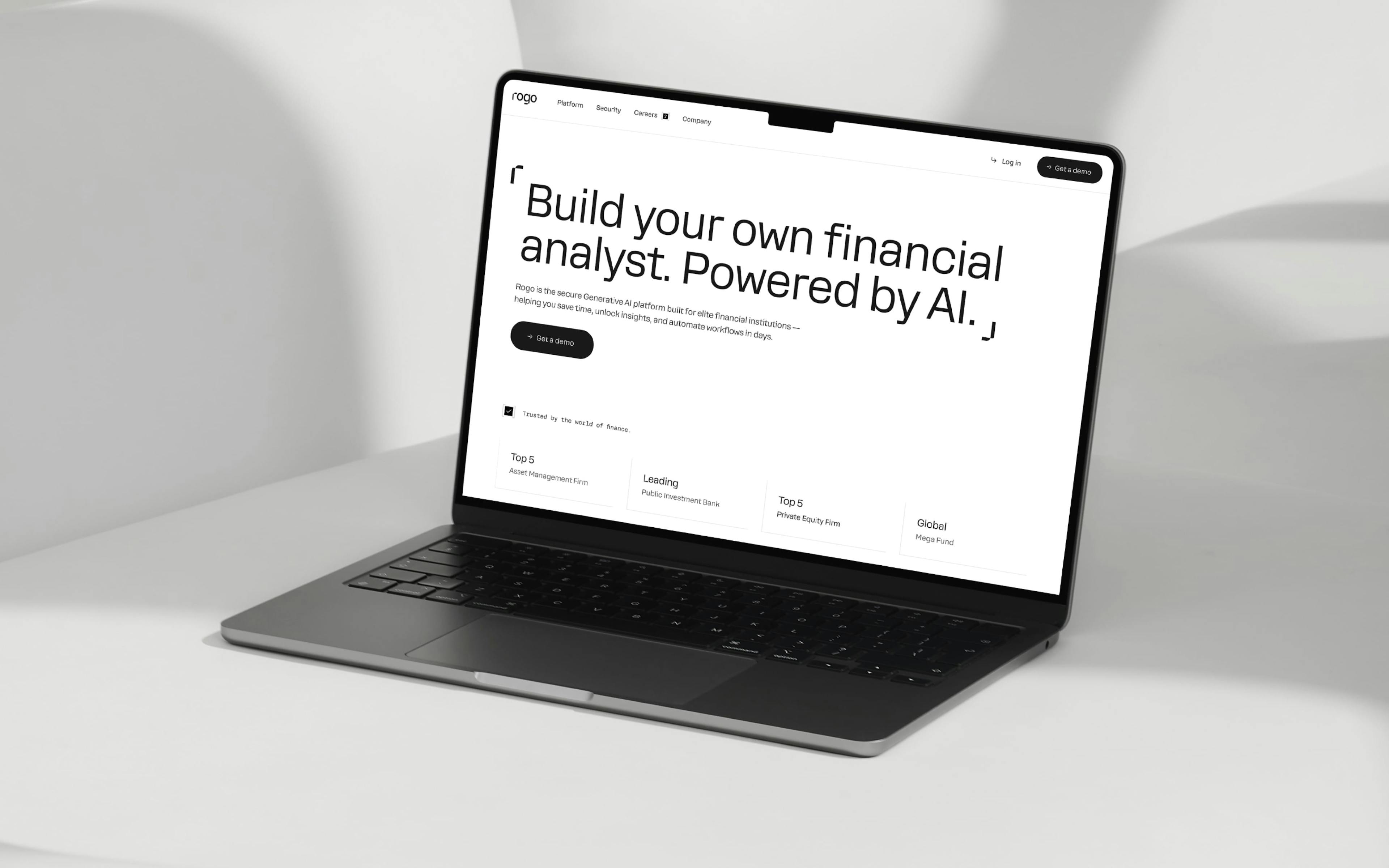

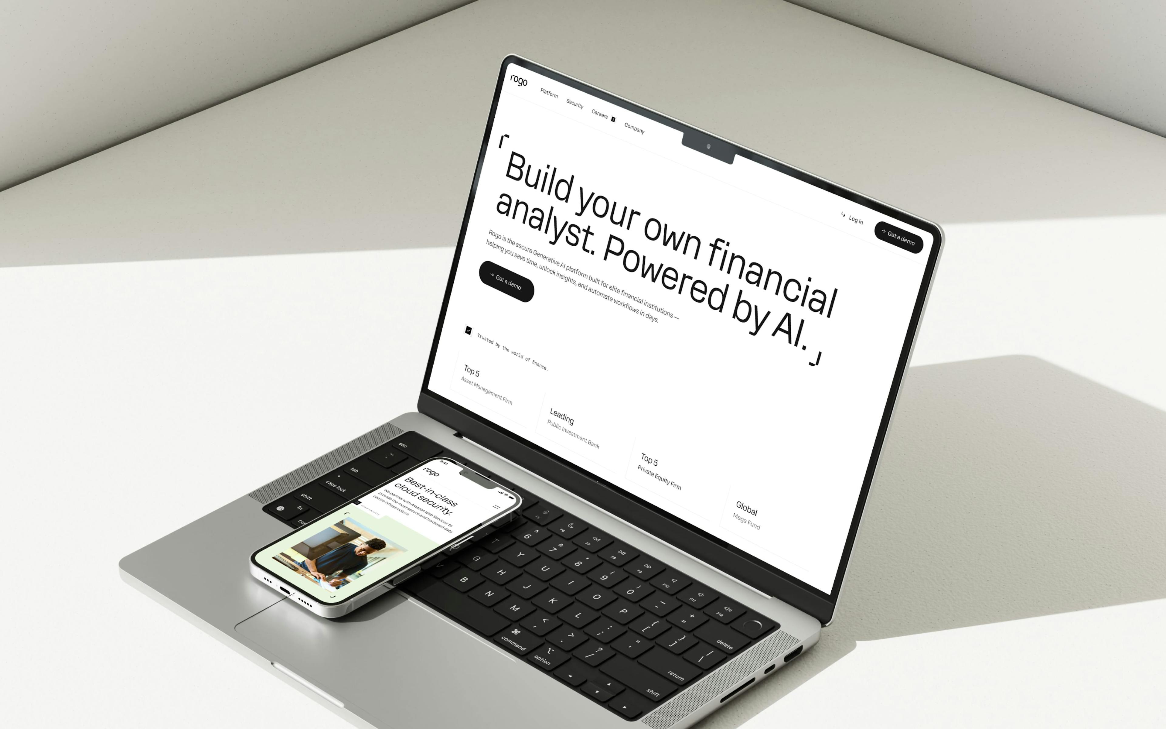
Framing the narrative.

It’s all connected.
From user interface elements to typographic details, the DNA of Rogo’s brand is evident in the strong family resemblance at every touchpoint and every step of the customer journey.

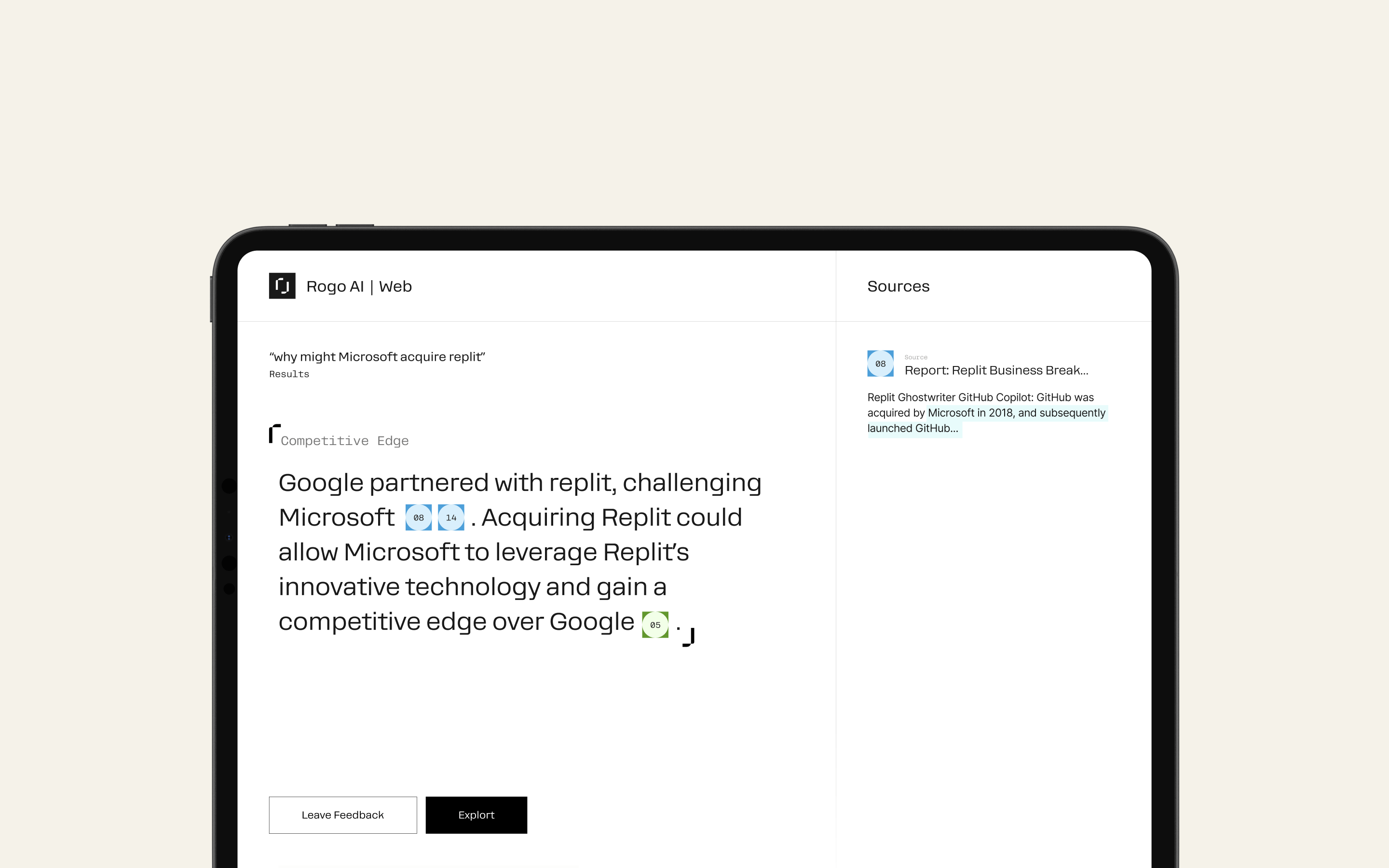
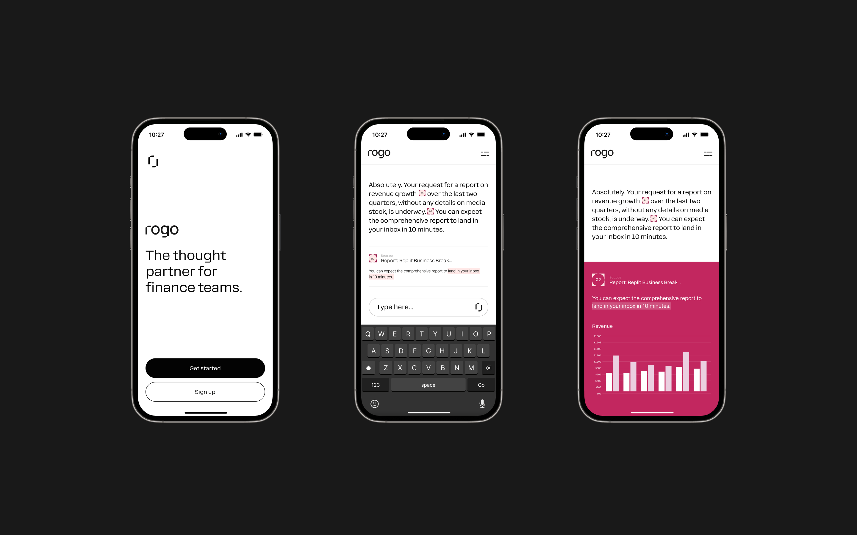
Citation needed. Rogo’s source references are a prime example of a branded moment within a product.

Make it pop. A stark base palette with bursts of colour to highlight and accent data.

Read-only. A clean, super-legible sans serif serves as a primary typeface, paired with a more technical mono for extra clarity.

People power. Photography is natural and warmly lit, to contrast with the generally stark aesthetic of the brand system.

Iconography. Simple, clean and legible, with a nod to the geometry of the logo.
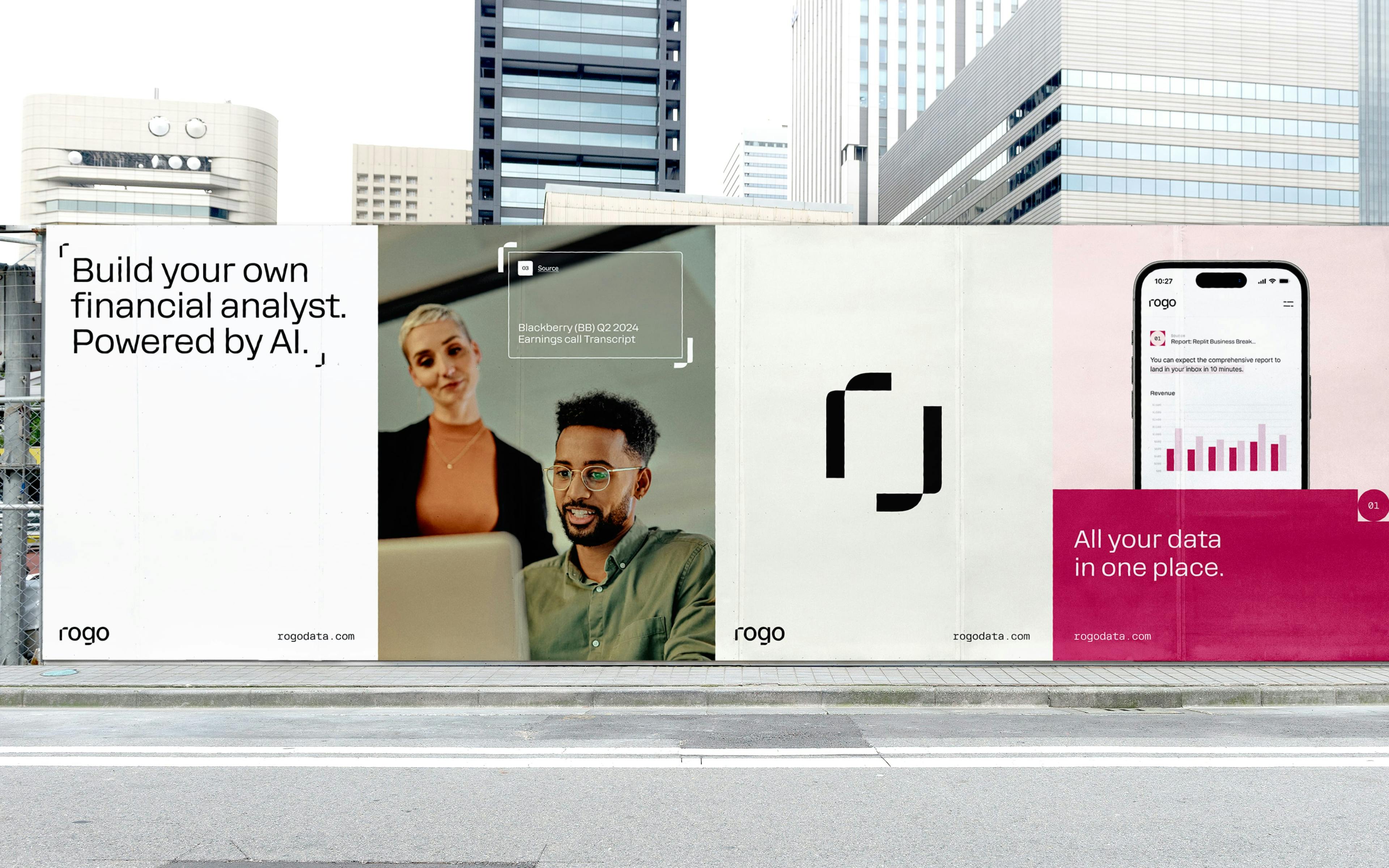
Make the Rogo bigger.


Product placement.
The primary surface of Rogo’s customer experience is their digital product, so baking their brand into the product becomes especially important. A brand that’s built to live in a product also gives designers opportunities for novel brand expressions, such as animation, cursor behaviour, haptic feedback, and even sounds.
Open the pod bay doors, Rogo.