- •Brand Strategy
- •Branding
- •Copywriting
- •Website Design
- •Website Development
- •Animation
Ben Wynn-Owen
Creative Director, Together
Easy money.
Born ready.
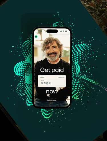
Elementary particles. The brand system’s core creative concept is the flow of digital money — fluid, seamless and high-tech. The electric green “Kinetic Square” is the foundational element, symbolising a single transaction transforming into fluid patterns, giving the brand a sense of movement, even when perfectly still.
Electric personality. Directly connected to the broader visual language, the illustration style supports both metaphorical and literal interpretations. It’s expressive, flexible and instantly recognisable.
On the spectrum. Four key visual devices — Kinetic Square, Texture, Supergraphic, and Illustration — let Aria flex its brand across a broad spectrum of contexts, ranging from functional to expressive.
Family traits. Aria’s logo is a direct descendant of the Kinetic Square, the animated version drawing inspiration from the more expressive Supergraphic device.
Looking for a type in finance. Aria’s primary typeface is the hardworking and structured 37 Lineca — both suitably techy and a good balance to the expressive illustration style. For no-nonsense body copy, the hyper-legible STK Bureau Sans steps in.
Colour of money. Aria’s palette draws inspiration from the world of physical currency, with an added jolt of electricity for good measure.
Net assets. Aria’s website puts the brand elements to good use, with lively graphics at the forefront to convey the idea of money in motion. Clean, unfussy, and enhanced by some carefully placed, eye-catching bits, it’s designed to tell an engaging story.
You have a Rive. Back in the day, showcasing a product’s features on a marketing website often meant using a linear product-shot video. Nowadays, however, Rive animations let our motion designers create interactive miniatures, giving prospective buyers a tangible, hands-on experience of Aria right there on the website.
Invisible touch. Getting the iridescent motion graphics to play well with other elements on the site was surprisingly tricky. But thanks to our clever developers and their transparent video formats, you couldn’t possibly tell.
Narratives with benefits. Branded user interfaces highlight the features and benefits of Aria’s product, in this case, demystifying its white-label API solution.
Adam Burn
Design Lead, Together
Clément Carrier
CEO at Aria