Driving progress.
Overview
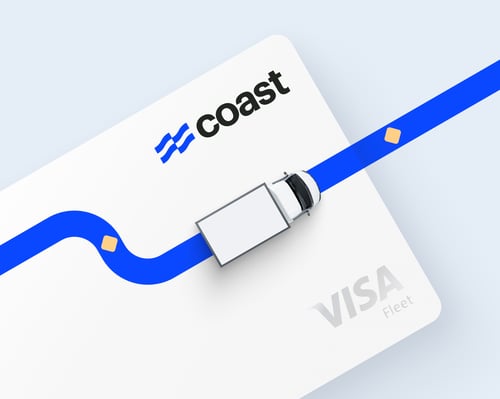
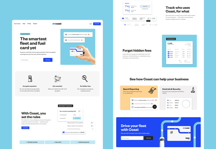
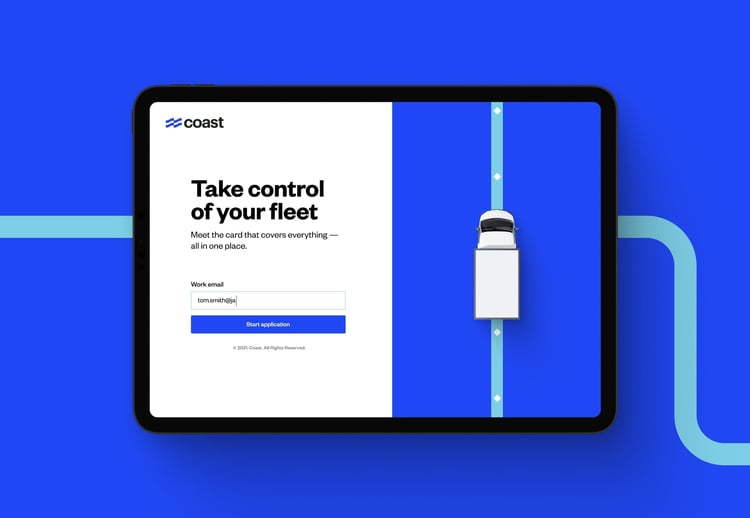
Coast is a fintech product designed to make fleet operators’ lives a lot easier. The team wanted a brand and website that would drive their business forward and drive their competitors out of business.

Coast is a fintech product designed to make fleet operators’ lives a lot easier. The team wanted a brand and website that would drive their business forward and drive their competitors out of business.
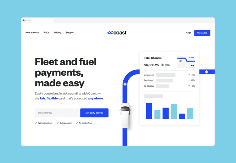
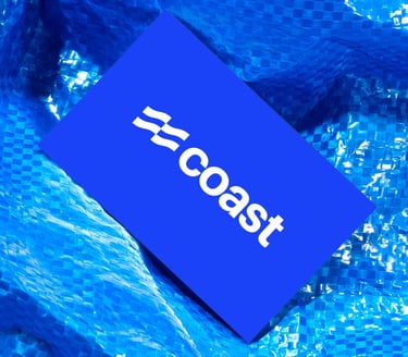
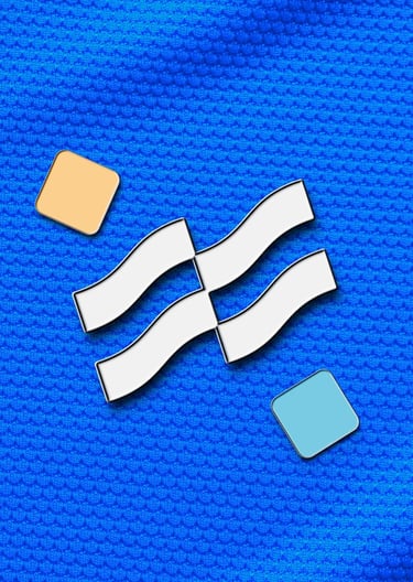
Smile and wave: A logo referencing coastal waves and flow of payments.

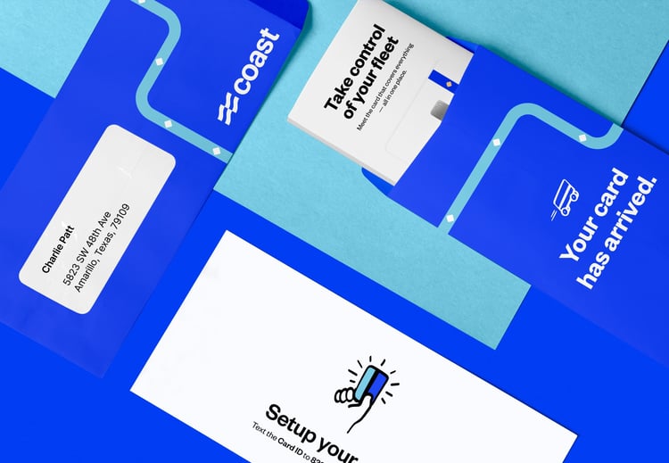
Bright and optimistic vibes, and a blue that makes Coast’s card stand out in any wallet.

A quirky, chunky variation of Founders Grotesk exudes friendly and down-to-earth professionalism.

A little more rugged than your average SaaS company.
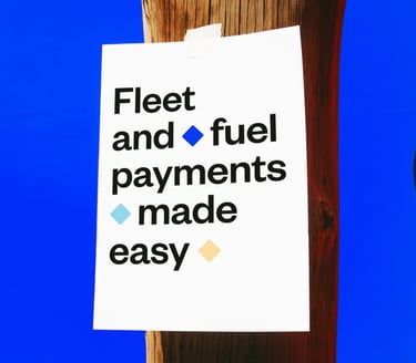
Plainspoken and straightforward, Coast’s voice takes its cue from customers.
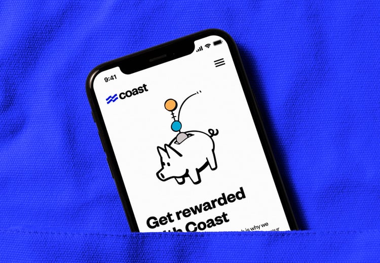
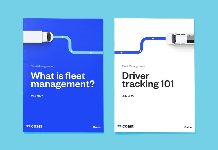
A little rough around the edges, Coast’s illustrations are designed to look like doodles on a notepad.




“Together is a kind of magic hat for tech startups. They’re one of the few agency teams that can help every step of the way — from inception to growth.”

Daniel Simon
Founder, Coast

With thanks to
Daniel Simon and Alek Grinberg.