Diffblue

Power grid.

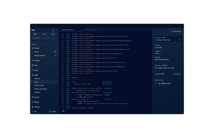
Autonomously writing code, Diffblue’s AI technology boosts developer productivity and code quality by writing Java unit tests with precision, at scale. It’s a brand story that literally writes itself.

  • Brand Strategy
  • Brand Design
  • Website Design
  • Animation
  • Development
james smith

Out of the blue.

Spun out of Oxford University’s AI research group in 2016, Diffblue quickly closed one of Europe’s largest Series A funding rounds, with Albion Capital, IP Group, and Citigroup among investors. In 2020, Cover, Diffblue’s autonomous coding platform quickly proved itself, with Goldman Sachs, also an investor, claiming it completed a year’s worth of Java unit test writing overnight. Just one hitch: the legacy brand didn’t reflect the maturity and sophistication of Diffblue’s product. Time for a glow-up.
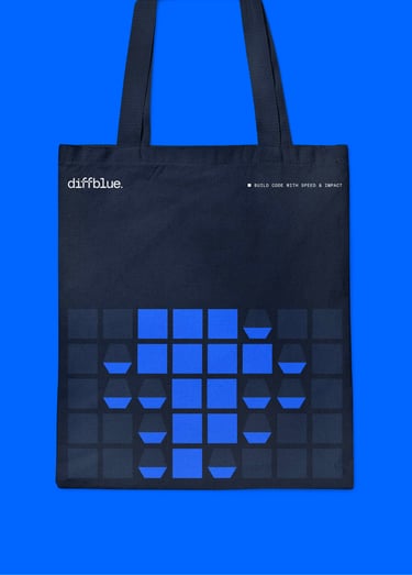
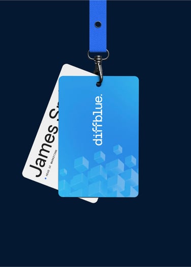
diffblue lanyarddiffblue teediffblue tote
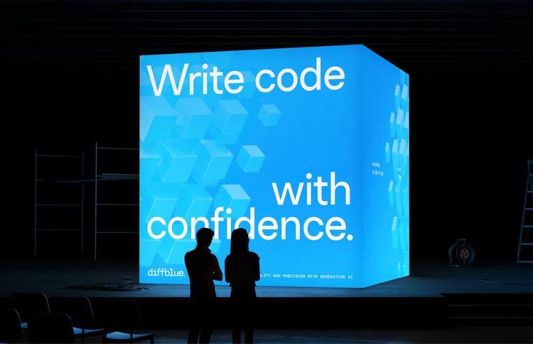
diffblue billboard

It’s elementary.

In search of a core creative concept, we aligned on Diffblue’s promise to deliver continuous code quality by writing code with precision at scale. Using these two notions — precision and scale — as metaphorical points of departure, we created a brand system based on the fundamental elements of the grid, the square and the cube, with squares representing individual unit tests, cubes representing the detailed, dynamic views of these tests, and the grid system representing scale.

Square won.

It’s a brand system that would make Euclid proud, with the building blocks of squares, cubes and grids echoing across the different brand elements. The outcome is a premium brand that exudes intelligence and vitality—unified, interconnected, and instantly identifiable.

  • Spot the difference. Diffblue’s logo echoes and references the brand’s visual language of squares and cubes.

  • A colourful character. The palette takes inspiration from the world of code as well as Diffblue’s Oxonian roots, with secondary colours that pair well with the primary Oxford Blue, and a pulsing gradient effect to indicate “something happening.”

  • type

    Atypical. Diffblue’s typeface is the clear, legible and flexible Chromatic, with Pro for headers and body, and Mono for code.

  • professional flair

    A professional flair. Brand photography places software developers at the heroic centre, styled with colourful flair and the warm glow of screens.

Untangled web.

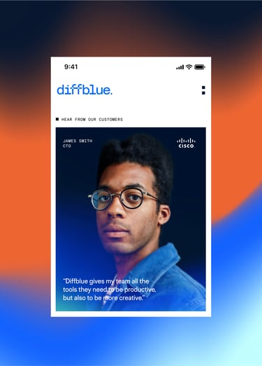
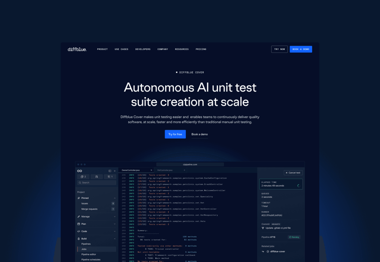
Diffblue’s website puts the new brand elements to good use, telling the story of a mature, dynamic company full of very clever people building groundbreaking products for a very satisfied clientele. The focus is on clarity, featuring ambitious case studies and use cases for decision-makers, and thorough documentation for developers. And speaking of devs, the site was of course built by Together’s own team using Next.js, and WordPress as a headless CMS.
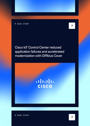
diffblue cisco iot
cover

Finally our brand and website represent where our company and product is today — a mature player in the ever-advancing AI for Code category.

1601356229872

Cassy Locke

Head of Marketing, Diffblue

product
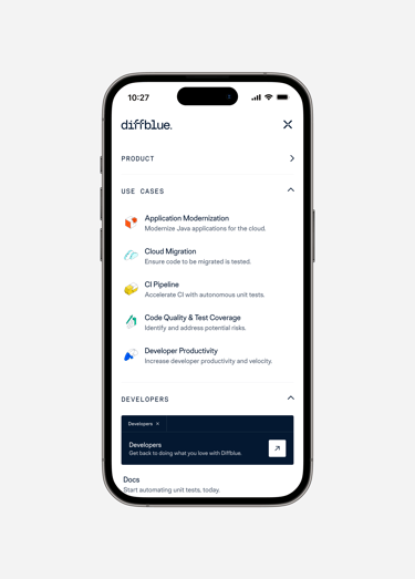
mobile
contact
With thanks to
Cassy Locke, Lee Hoosein, Zoe Laycock and Lisa Raynaud.

There's more.