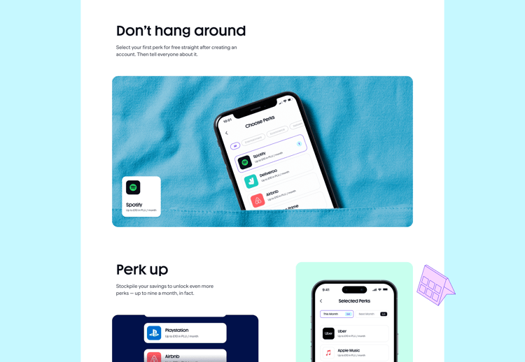
Perk up.

Overview

What we did

Plutus wanted to bring cryptocurrency from the mavens to the masses. To help nudge things along, they asked us to step in.
View Website

Newsworthy

The identity avoids the esoteric aesthetics of crypto and Web3 with a much more playful and approachable aesthetic.
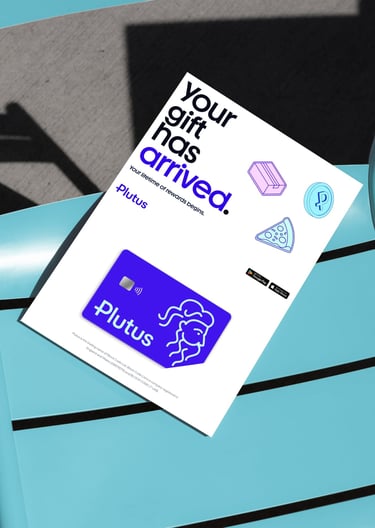
New Card

Trends with benefits.

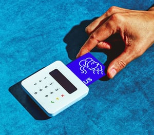
To accelerate crypto’s ascent up the adoption curve Plutus came up with a Trojan horse: A rewards program on everyday spending, giving cardholders cashback in their own cryptocurrency, as well as perks and discounts. Clearly a big rebrand and an upgraded web presence were in order. 

The real deal.

With a reputation for being esoteric, volatile and complicated, widespread acceptance of cryptocurrency has remained elusive. The core creative concept was to position Plutus as the bridge between the digital economy and the “real” one, bringing crypto out of the shadows into a colourful world full of people and stuff, perks and rewards.
Pizza
Pins
Ooh

This is normal.

Energetic, exciting and joyful, the brand comes to life through a combination of ingredients, including a unique mix of photography and illustration, and a whole lot of motion. People-first and lifestyle-led, it gives Plutus the feel of a consumer brand.

Two sides of the same coin. Plutus’s wordmark speaks the language of finance, with a capital P that doubles as the symbol for its own cryptocurrency, Plu.

Letters of credit. Clear, legible and packed with character, Plutus’s typefaces adhere to the underlying geometry of its logo, “face” icon and iconography.

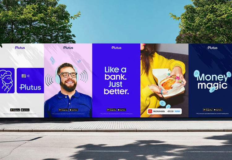
Real good. The brand photography shows ordinary people — no finance bros or crypto lords — superimposed by playful illustrations representing products and services, perks and rewards. The aim, as always, to bring Plutus out of the digital world of crypto and into the real.

Typography

Money talks. Plutus’s voice and tone guidelines strictly forbid the use of fintech jargon, including nonsense like NFTs, DeFi, and talk of “fiat currencies.” Straddling the line between fun and reliable, the focus is squarely on the rewards, with only minimal references to crypto.

Cash flow. Motion is a big part of the brand. Coins flip and roll, rewards pile up, and stash of cash grows.

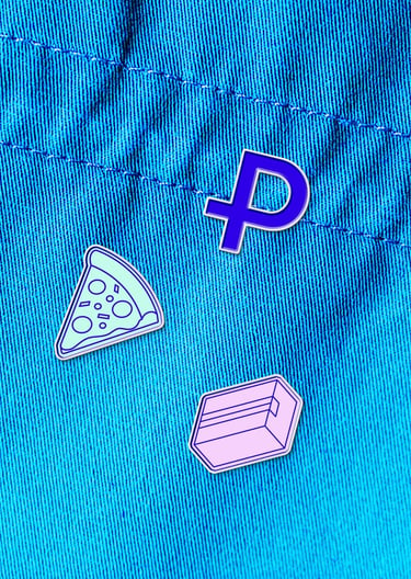
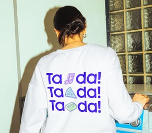
Token representation. Inspired by digital rewards, Plutus’s icons, also known as tokens, are brimming with emotion, energy and depth. Coming to life in motion, they pair perfectly with the playful tone of voice.
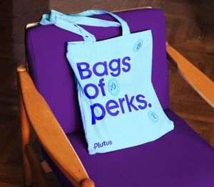
Bag
Card
Tshirt
Beanie
Slide 1 of 4

Greetings, card.

The goal of the marketing website is to showcase the Plutus card and the stack of perks that come with it, without too much fuss about crypto. The navigation is action-oriented, using the verbs, “Earn”, “Bank” and “Swap” to immediately clarify what Plutus is about. Full of interactive motion graphics, spinning coins and animations, the site straddles the line between fun and safe, appropriate for a card that has ambitions to become people’s day-to-day primary spending account.
Web

With thanks to

Filippos Protogeridis

Minyi Soon

Marcus Soulsby

Contact Information

Work with us

Partner with us.

We work in all things creative and strategy, and
 look forward to discussing your project.

Stay informed.

Sign up to our newsletter for a global view on design and technology.