Designing the new internet.

What we did
Overview
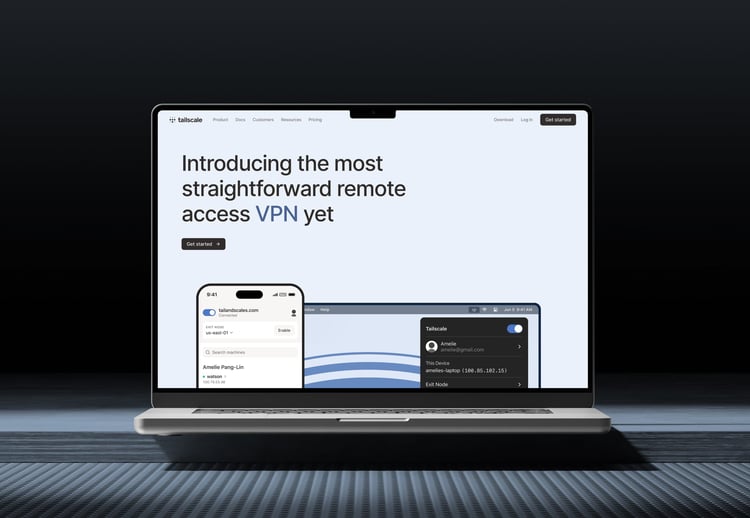
Tailscale began as a deeply respected open-source project. A simple way to securely connect users and devices across any network. Developers loved it. Teams trusted it. And adoption spread globally. When Tailscale partnered with Together, the product was already world-class, but its website still reflected its early identity. The company was preparing to expand into larger, more complex organisations, and needed a digital presence that could speak to enterprise buyers without losing the trust of its community.
Since launch, Tailscale’s trajectory has continued to accelerate. The company has raised $160 million in Series C funding, led by Accel with participation from CRV, Insight Partners, Heavybit, and Uncork Capital. It has been named by Fast Company as one of the Next Big Things in Tech, recognised as a Mid-Market Maverick. And its customer base now includes companies such as Revolut, Instacart, Mercury, Duolingo, and Airbus.


