Trullion

It all adds up.

To rescue oppressed finance teams from the tyranny of the evil Lord Spreadsheet, the founders of Trullion built a formidable new accounting platform powered by artificial intelligence. But first, they needed a bit of branding magic.

  • Branding
  • Website Design
  • Content
  • Development
  • Illustration
Content
02

Creative accounting.

Wouldn’t it be nice to have an AI-powered platform that makes the lives of finance types a lot more pleasant? That’s what a team of founders with a background in finance thought. So they came up with one. They called in Trullion, and it automates all kinds of indispensable accounting workflows that no one really likes doing manually. Armed with a new round of investment from battle-hardened venture capitalists, Trullion asked Together to help create a brand around it all.
Large Block

The first Trullion is always the hardest.

Entering a crowded and conservative market, Trullion had three challenges. First, to firmly set the brand up as an innovator with a fanatical devotion to efficiency, compliance, and accuracy. Second, to cement their transition from a point solution for lease accounting to a full on accounting platform. Third, to strike the right balance between innovation and authority.
03
04
Large Block

A brand you can account on.

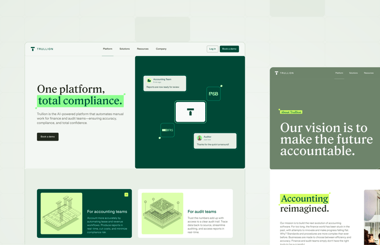
Inspired by Trullion’s mission of bringing structure, accuracy and unity to financial information, we loaded the brand with visual cues that directly reference the product: a highlighter device for emphasis, a rectangular frame motif reminiscent of the cells of a database, and a typographic layout that mimics Trullion method of extracting data from financial documents.

  • Gallery Column

    A sophisticated pairing of a variable serif and a minimal sans-serif — the squared spurs and terminals of the latter mirroring Trullion’s existing brand mark.

  • colour

    Trullion’s product design informed the brand’s renewed palette, with a combination of deep tones and vibrant highlights.

  • illo

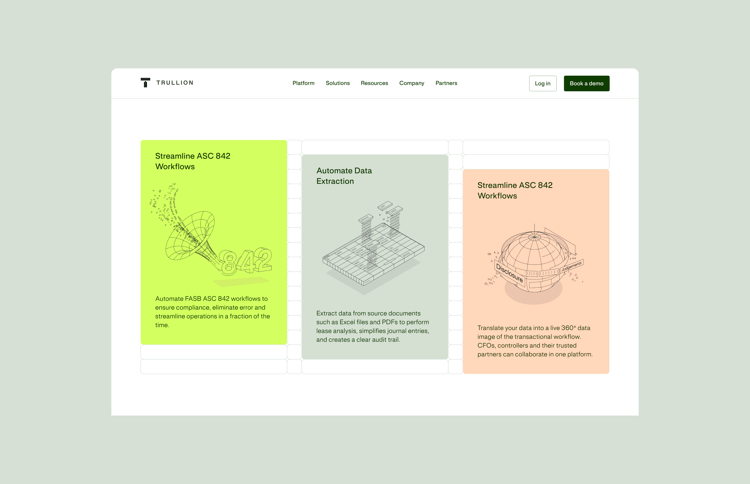
    Adding character and depth to the brand, the illustration style references numbers and data-cells to emphasize core features and benefits.

  • photo

    A custom image library leans on the muted tones from the new color palette, in a simple and authentic style that matches Trullion’s identity.

It’s alive.

The main goal for the website was to bring the platform to life, establishing a clear continuity between product, brand and marketing. With all the elements in place, the site drives conversion by building a compelling case for Trullion’s unique selling proposition.
01
Large Block 1
Large Block web
cards
phone
illos cards
web 2
With thanks to
Rocky Brody, Shoshi Goldstein, Bonnie Seaman, Daniel Shtainberg

There's more.