613a0c11c446a15171e5dba4 unit brand white 1unity fixed

unity masthead

Being a banker is harder than it looks. Unit makes it a lot easier, by giving tech companies the infrastructure to bake financial features like accounts, cards, payments and lending directly into their products.

What we did

  • Branding
  • Positioning
  • Copywriting
  • Web Design
  • Development

Together has been an essential partner in developing our brand and building out our website. We think of them as an extension of our team.

john 1

John Minervini

Content Marketing Lead, Unit

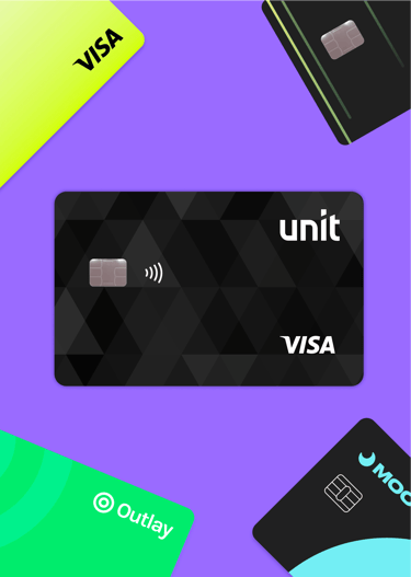
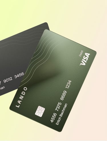
colour cards
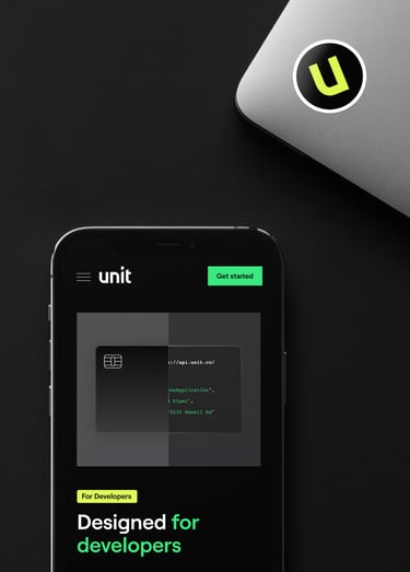
Unit Sticker

Just add banking.

Meet Unit, a brilliant banking-as-a-service platform that lets companies build sophisticated financial solutions right into their own products. Based in New York City and Tel Aviv, with backing from top investors including Insight Partners, Accel, and Better Tomorrow Ventures, Unit came to us in 2021 asking us to help build a brand around their service.

Logo 1

Unit is hidden away inside other products. Our biggest challenge was creating a brand and marketing for a product that people never see.

will

Will Beeching

Creative Director, Together

11 colours 1

A sound financial position.

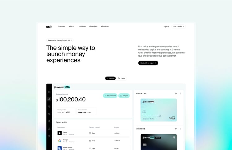
An early-stage startup that wanted to go big, Unit wanted to claim its position as a serious contender in the banking-as-a-service sector. Our task was to evolve their brand, refine their product positioning and communicate their vision for the future of financial services with an effective new website.

07 notification
12 environments

Built to code.

Most companies offering banking-as-a-service speak the language of finance. Going against the grain, Unit decided to position itself as the solution for the people who actually build things — startup founders and developers. Logical, clear and utilitarian, Unit’s brand would be about getting things done.

  • 14 colour 1

    Avoiding the primary blues and greens so popular in fintech, Unit’s color palette signals that something a little different is going on.

  • 15 gradient

    Lively mesh gradients serve as a fine metaphor for the flow of money.

  • 16 type

    A sleek sans serif with features familiar to developers: slightly chunky with flat descenders.

  • 17 illustration

    Custom illustrations with thick lines, bold colors, and subtle raster effects.

  • icons

    Isn’t it iconic?

Invisible touch.

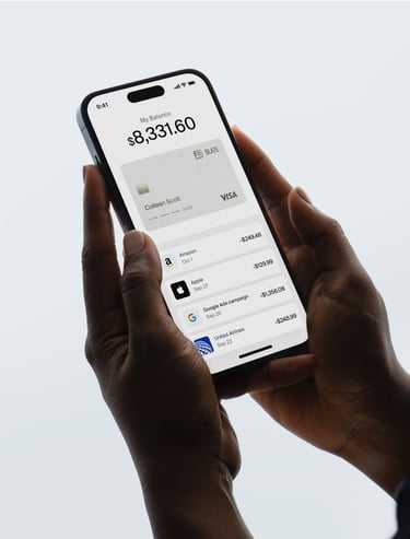
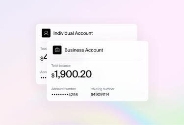
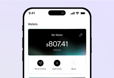
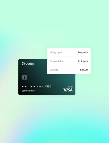
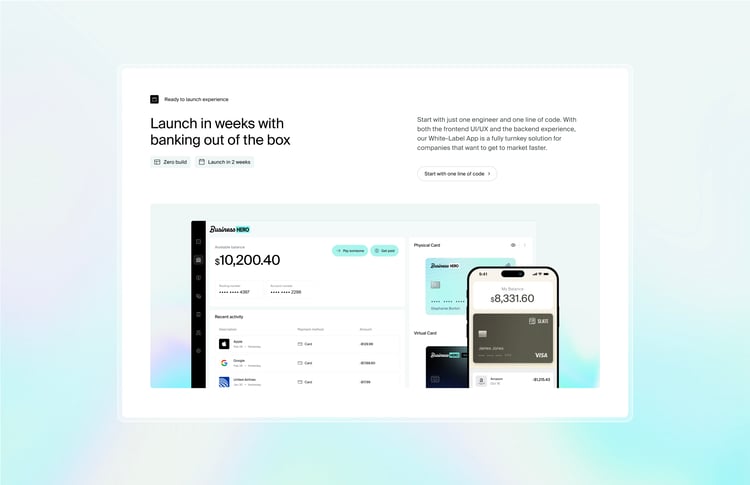
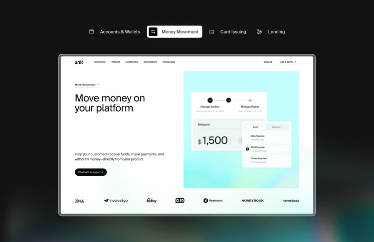
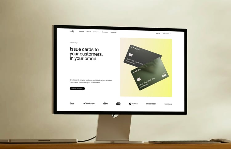
How to represent a product built to be folded into other digital products? We got around Unit’s cloak of invisibility by showing it in action, in real life, across a variety of use cases and scenarios.

Web
30 payments 2
31 cards
27 iphone 2
28 overview

Backend to the future.

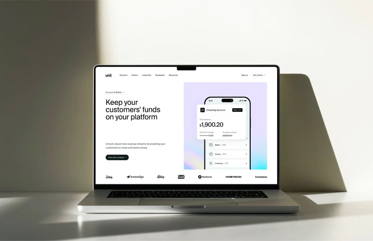
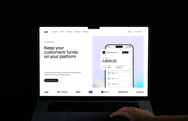
To make life more pleasant for Unit’s marketers, we built their site using Webflow as the backend CMS. Webflow’s component-based architecture makes it easy for the team to build new pages quickly, with plenty of flexibility and no risk of breaking the design.

36 webflow
With thanks to
Louise Ng, Itai Damti, John Minervini, Jeff Lesser
logostytch
You shall no password.
Masthead 1